Garmin Vivomove HR Hybrid Smart Watch
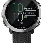
Fashionably fit is just a tap away with vívomove HR. This stylish hybrid smartwatch features a crystal touchscreen with a discreet display. Precision hands show the time and dynamically move away when you swipe through your messages, heart rate and more.
- Stay connected with smart features such as music controls and smart notifications for incoming calls, text messages, calendar reminders and more (when paired with a compatible smartphone)
- Estimates heart rate with elevate wrist heart rate technology
- Wellness monitoring tools, such as all-day stress tracking and a relaxation timer, help you manage stress; Includes advanced sleep monitoring with REM sleep
- Displays steps, calories, distance, heart rate and intensity minutes
- Effortlessly change your look with industry standard 20 millimeter quick release accessory bands.Display resolution: 64 x 128 pixels





pBear –
We pick up VivoMove HR (Sport) from BestBuy couple days ago (instead of Amazon because BestBuy has the watch now) and the initial impression is, we like it.Coming from VivoSmart HR, we are looking for a lightweight and easy to use activity tracker that has some extra features (time, alarm and notifications). GPS and golfing are not essential features for us. We like our VivoSmart HR, but it is not the most elegant activity tracker (ugly) in the market.VivoMove HR looks like a modestly priced watch (maybe a sub hundred dollar Timex?), feel light, comfortable and much more attractive than VivoSmart HR. Set up is a breeze with Connect app and all functionalities work as advertised. Coming from VivoSmart family, you will feel right at home. Love the “Do Not Disturb” feature especially if you use it as sleep tracker. Compare to VivoSmart HR, vibration intensity for alarm and notifications is much lighter at medium setting, but you can set it to high.One major concern that we have is the screen readability, especially under the bright sunlight. Compare to VivoSmart HR, the texts are less legible, mainly due to the reflection from the glass (hint to Garmin, anti-reflection coating). The auto brightness will kick-in in couple of seconds and make the texts brighter. That does help a little. Overall, screen readability is a lot better than what we expected.We have the watch for 3 full days now and the battery is at 55%, so it should last 5 to 6 days of usage on a full charge.Overall, if you are looking for an activity tracker that easy to use, lightweight and comfortable, most of all, you are not “ashamed” to wear it everyday (good looking watch), while GPS, golfing and Garmin Pay are not essential features for you, give VivoMove HR a try.I think price point is a little high for the such high competitive market (minus 1 star). Price it at $150 to $175 and we got a winner!
Brittany F. –
I’ve had this watch about 2 weeks now. I love it. I get compliments on it all the time and then when I show them that it is an activity tracker it really blows their mind. I love the look, the feel and it works well with my business casual attire better than my fitbit. I have had no issues with the anakog hands keeping time. The only critiques I have are 1) can’t see the digital face when it’s really sunny. Not a big deal, just a inconvenience. 2) the Bluetooth radius is not very long. I live in a condo and when I am moving about the house I constantly get notifications Bluetooth connected then not connected then connected again. Other than these 2 items, blows my fitibits that I have owned out of the water.
Detail Focused Reviewer –
This is not a product category that has a lot of well thought out, fully baked products. Smartwatches can be useful and fun but can also be flakey, complicated, amazingly bad at simple things, and visually hideous. Garmin has a pretty nice product in the vívomove HR that rarely leaves my arm with some real strengths but also some all too common (among smartwatches) flaws. I think it’s the best product on the market but I am still constantly annoyed in small ways and bewildered why simple things are not done properly. Before I list a bunch of negatives, please keep in mind many of these negatives are industry wide issues. Garmin may not be pushing innovative approaches in this watch but it’s comparatively pretty great. As such, I’d only compare this to similarly detailed reviews of other smartwatches or best for someone looking at this vs living without a smartwatch.Pros:-Battery life is awesome. A week in actual use if not more. It’s plenty. It’s at least twice as much as plenty.-The hands show the time, all the time. They also move out of the way (minute hand goes to 10minutes and the hour hand goes to 10 hours) which is cool to look at when you utilize the screen.-The touchscreen is completely invisible when you’re not showing something. It really looks like a normal watch. It’s tasteful. Not too nerdy. People won’t think you’re wearing a fitbit or a calculator watch.-It has weather data. I can’t live without quickly accessing the weather for today and tomorrow on my watch. This is why I have a smartwatch and in and of itself rules out most of them.-The screen is sufficient for text messages and showing you the name or number of who is calling. It can also tell your phone to pick up which is a great thing for iphone users who can’t properly answer their own phone by sliding the answer button across the screen due to OS lag.-The heartrate meter and the pedometer work fine. I’m not totally into fitness stuff but they don’t get confused by my leg shake while sitting or similar. The meter does not dig into your wrist at all. It’s like a normal watch level of comfort.The meh:-The screen could be bigger. The second and minute hands move out of the way so the entire lower half of the watch could be a screen. Would give a few more characters of room for text messages which would help a little.-The hands move to 10 and 2 regardless of if they interfere with the screen or not. If it’s 10:01, they’ll move to show 10:10 when you interact with it. There’s no need to move the hands in that situation. This might be intentional, the moving hands is kinda a party piece.-The interface consists of touch left, touch center, touch right, swipe left, swipe right, and hold. It’s still remarkably repetitive within that design to get through the menus. Something like touch, hold, swipe left, swipe left, touch center, touch center, swipe left 4 more times, touch center is probably a typical interaction for like, asking it to resync. It’s not super bad but it’s not properly optimized.-The watch is a little thick and is a little big (44mm). Neither is particularly noticible but put a normal 42mm watch next to it and it will look decent sized. Considering the battery life I think the thickness is pretty impressive really and 44mm is hardly “large” in today’s oversized world but it’s important to point out. I got confused by the different watch choices Garmin offers in this product but as far as I know, they’re all 44mm around with 20mm bands and roughly the same thickness.-The screen isn’t bright enough in direct sunlight. The hands however are great in direct sunlight. Few smartwatches have hands. You will know what time it is while somebody with an apple watch tries to shield their screen.-The fitness monitor concept seems pretty pervasive in our society but it’s really pretty half baked. You want to know if walking more and using the stairs more is going to burn a couple more calories a day? Yeah, it works. I guess that’s nice. It’s far from a life-altering wellness partner or a substitute for a personally designed exercise program.-No replies to text messages or text replies to declining a phone call. I had a pebble and this sorta worked, it was buggy. In concept it’d be nice to have a few canned messages like “ok” or “I’m in a meeting I’ll get back to you in a couple minutes” that you could pick from. I don’t think many watches do this well so I put it here.The bad:-The face is not lit and the hands/hashes are not glow-in-the-dark. Why? This seems so simple. The “black sport” version I got has a very yellow minute hand and a very yellow 12 and 6 hash markers but both have no glow. The whole point of this watch is the hands, isn’t it? Why make them useless in the dark. You can of course activate the smartwatch (which I set to double click) and it can show the time digitally which will be QUITE BRIGHT when it’s too dark to see the hands.-There is no (or does not function well ) automatic LED backlight adjustment for ambient light conditions. It’s too bright or too dark nearly every time you use it.-The sleep tracker thing is somewhere between nonsense and inaccurate.-The price is nearly twice as much for the metal casing ones with nice bands. The cheap version at least has some yellow paint to help you read the hands (not glow though) and the band has some easy quick-release pins but I am disappointed Garmin wants >$100 more simply for a metal case. The band got replaced by a conventional metal mesh band which I like a lot better. Annoying how poorly packaged the nice watch hardware is.The really bad:It loses sync 1-2 times a day. Every morning when I wake up I have to spend ~60 seconds going through a specific process. 1) Open the phone app (even if you left it on your phone all night) 2) wait for it to sync 3) select pair now under settings+Bluetooth settings. Only then can I get the high and low temperatures for the day streamed to my wrist. Certainly not going to be 5 seconds after I open my eyes in the morning.I like it. I’d recommend it. I just don’t understand why more thought can’t go into the basic operation and layout of these products. Technology wise it all seems pretty great. Clean up the interface. Add glow paint to the hands and a couple hashes. Come up with some way to have it sync without me telling it to on my phone in the morning. Make the screen a little bigger. Stop making me swipe through your menus so much, you have more control points than you’re utilizing.The device works pretty well as a business tool. You get notifications of upcoming meetings that show up on your phone. You can see who’s calling you in a meeting politely. You can even sneak reading a text message in a meeting. The hands and invisible screen make it very stealthy and it’s fairly conservative design means you can wear it with most attire (even a suit if you change the band to something nicer). It seems targeted more at the fitness crowd but it’s strengths lie more with work.
Amy –
Watching not showing the correct time often.
Kathleen Kenney –
I have finally found the watch I’ve been searching for!After a few failed attempts with other watch brands & styles, this watch meets my needs well.1. I can set MULTIPLE alarms! Hallelujah! (The last smart watch I bought advertised “alarms” but I could only set 1. Super disappointing!)2. I can read texts and other notifications without them opening on my phone. I actually don’t open a text on my phone until I am actually ready to do whatever it is I need to do with it. The blue dot on the side is my reminder. I love that I can read the text on my Garmin watch without losing that little blue dot as my reminder on my phone. Nice!3. This watch is not just wash-your-hands proof, it is SWIM proof! I love and need that. I want to live in my watch. Shower = yes! Pool = yes!4. The band is flexible and light (I got the pretty sea foam which is what I would baby blue.)5. Good looking! It’s classy and sporty at the same time. I haven’t researched to see about swapping out the band, but I imagine it can be done.I’m so happy with my purchase!
Karen Sapp –
Great Garmin Vivomove HR! E Zee Electronics was great to work with! Thanks!
Johnny Spot –
Really like this watch, one of my favourite purchases actually. Looks pretty sleek, comfortable, goes several days on charge. This particular sand colour is almost a khaki, but glad I chose it vs the regular black. No problem in the shower, have even dunked it in hot tubs, screen is pretty scratch resistant and showing almost no wear after 3 months of daily use. Wear it playing hockey 5xweek, fits under cuff of glove and can’t feel it on